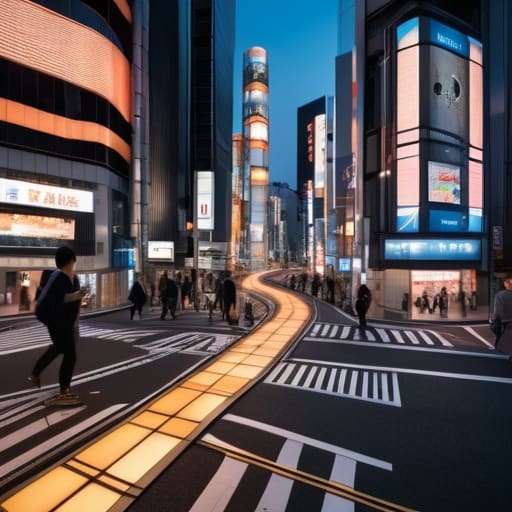
I remember standing in the middle of Shinjuku Station last autumn, the air thick with the scent of roasted coffee and the frantic, rhythmic shuffle of ten thousand commuters. I had my notebook out, trying to trace the logic of the exits, but the sheer volume of digital signage felt less like guidance and more like noise. Most people think urban wayfinding is about flashing screens and high-tech apps that promise to lead you by the hand, but they’re wrong. True navigation isn’t found in a glowing smartphone screen that disconnects you from your surroundings; it’s found in the subtle, intentional cues built into the very bones of the city.
In the pages that follow, I’m not going to give you a list of gadgets or expensive travel tech. Instead, I want to share what three decades of managing complex logistics and wandering through Tokyo’s labyrinthine alleys has taught me about reading the landscape. I will show you how to look past the visual clutter to find the quiet, functional patterns that actually dictate how a city breathes. This is about developing a sense of direction that relies on observation and intuition, rather than just following a blue dot on a map.
Table of Contents
Legibility in Public Spaces and the Citys Breath
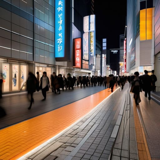
I often find myself sitting on a bench in Shinjuku, watching the tide of commuters surge through the gates. To the untrained eye, it is pure chaos. But to me, there is a profound legibility in public spaces that keeps the entire machine from seizing up. It isn’t just about the bright neon or the digital displays; it is about how the environment communicates its intent without saying a word. When a city is designed well, you don’t feel the need to constantly consult a map. Instead, you feel a sense of intuitive urban navigation, where the very architecture nudges you toward your destination.
This clarity is rarely the result of a single grand gesture. Rather, it is found in the subtle interplay of street furniture and signage—the way a specific color-coded line on the floor guides a tired traveler, or how a well-placed tactile paving strip provides a silent path for the visually impaired. This is where the city truly breathes. When the design is seamless, the friction of travel vanishes, leaving you free to actually observe the soul of the streets rather than fighting against them.
Environmental Graphic Design as a Quiet Map
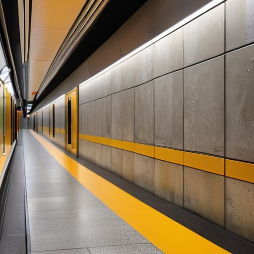
I’ve often found that the most effective maps aren’t the ones you hold in your hand, but the ones etched into the very fabric of the station walls. In the labyrinthine depths of Shinjuku, for instance, I don’t look for a single grand sign; I look for the subtle cues of environmental graphic design that guide the flow of thousands. It is a silent dialogue between the architect and the commuter. A specific shade of yellow on a floor stripe or a particular icon placed at eye level acts as a tether, preventing the traveler from drifting into a state of cognitive overload.
When these elements work, they achieve a kind of intuitive urban navigation that feels less like following instructions and more like a natural instinct. You aren’t decoding a complex language; you are simply responding to the environment. I see this most clearly in how well-placed street furniture and signage can transform a chaotic junction into a legible path. It isn’t about being loud or colorful; it is about providing just enough information to allow the mind to rest, letting the city’s design do the heavy lifting so you can focus on the details that actually matter.
The Logistics of Wandering: Five Principles for Reading the City
- Follow the tactile cues, not just the signs. A city often communicates through its textures—the way a curb changes, the shift from cobblestone to smooth asphalt, or the specific tilt of a subway entrance. These physical transitions are the city’s way of telling you that you are entering a different zone.
- Master the hierarchy of transit hubs. Don’t try to grasp the entire map at once; instead, learn the logic of the major arteries first. Once you understand how the primary lines intersect, the smaller, secondary veins of the city become much easier to navigate by intuition rather than by rote memorization.
- Look for the “human-scale” markers. While the massive digital displays in Shinjuku are impressive, the real wayfinding happens at eye level. Look for the small, weathered street numbers, the specific color of a local bus stop, or the way a particular shopfront marks a corner. These are the landmarks that don’t change when the technology does.
- Use the rhythm of movement to find your bearings. In a well-designed urban space, the flow of people acts as a natural guide. If you feel lost, observe the direction of the crowd; they are following a logic of efficiency that is often more reliable than a poorly placed sign.
- Carry a physical anchor. There is a certain cognitive clarity that comes from sketching a route or marking a map by hand in a notebook. It forces you to slow down and actually observe the geometry of the streets, turning a moment of being lost into a deliberate study of the urban layout.
The Quiet Logic of the Urban Flow
True wayfinding isn’t about loud, neon signage; it is about the seamless, almost invisible integration of information that respects a traveler’s need for calm and clarity.
To understand a city’s true efficiency, look past the grand landmarks and observe how the smallest details—a tactile paving strip or a well-placed directional arrow—guide the collective rhythm of the crowd.
A legible city is a functional one, where the transit system acts as a reliable circulatory system, allowing the individual to move through chaos without losing their sense of place.
The Unspoken Geometry of the Street
“A well-designed city doesn’t shout at you with neon signs and frantic directions; it whispers through the logic of its pavement and the steady, predictable flow of its transit lines, allowing you to move not as a confused stranger, but as a participant in its rhythm.”
Rurik Salonen
The Unseen Architecture of Movement
Ultimately, wayfinding is far more than a collection of arrows and color-coded lines on a station wall. It is the silent framework that allows a massive, breathing entity like Tokyo to function without collapsing into its own weight. We have seen how the legibility of a space dictates our sense of calm, and how environmental graphics act as a subtle dialogue between the city and the traveler. When these systems work, they disappear, leaving us free to move through the world rather than fighting against it. A well-designed city doesn’t shout for your attention; it simply guides your footsteps with a quiet, logistical grace.
As I sit here in a small café near Shinjuku, sketching the intersection of two subway lines in my notebook, I am reminded that the best way to truly see a place is to stop looking for the landmarks. Instead, look for the flow. Look for the way the pavement directs the crowd and how a single, well-placed sign can turn a moment of panic into a moment of discovery. To understand a city, you must learn to read its unspoken cues. Once you master that language, you realize that you are never truly lost—you are simply learning how the city breathes.
Frequently Asked Questions
How can we balance the need for clear, efficient signage with the desire to preserve the aesthetic character of a historic neighborhood?
It’s a delicate friction, isn’t it? In my years in logistics, I learned that efficiency shouldn’t be loud; it should be intuitive. To preserve a neighborhood’s soul, signage must stop shouting. Instead of garish plastic, we should look toward materials that age alongside the architecture—brushed bronze, weathered wood, or even subtle stone engravings. The goal is “invisible guidance”: signs that provide clarity through placement and typography rather than visual intrusion, letting the street’s history speak first.
In an era of ubiquitous GPS and smartphone navigation, is the physical design of a city's wayfinding systems becoming obsolete, or is it more vital than ever?
The smartphone provides a route, but it doesn’t provide a sense of place. When you’re staring at a blue dot on a screen, you’re navigating a digital layer, not the city itself. You miss the tactile cues—the way a station’s floor tiles change texture near an exit, or how a specific shade of signage guides the flow of a crowd. Digital maps offer efficiency, but physical design offers orientation. One tells you where to turn; the other tells you where you are.
How do different metropolitan transit systems communicate their logic to a newcomer without overwhelming the senses?
It comes down to a hierarchy of information. The best systems—take Tokyo, for instance—don’t try to tell you everything at once. They use a layered approach: color-coding for the broad strokes, distinct iconography for quick recognition, and subtle floor markings to guide the flow. It’s about reducing cognitive load. A well-designed system whispers its logic through repetition and consistency, allowing you to navigate the chaos without ever feeling like you’re fighting the architecture.
