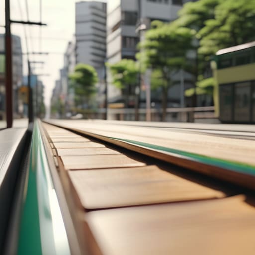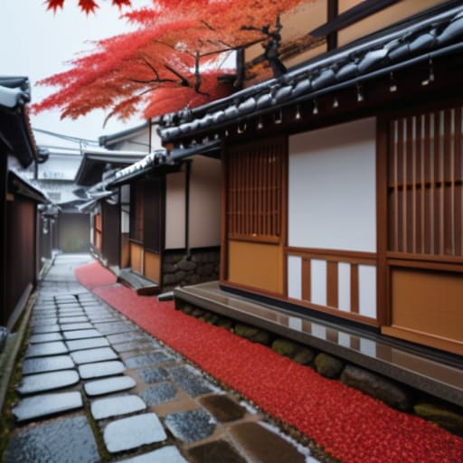
I was sitting on a wooden bench near the Shinjuku station platform last Tuesday, watching the humidity lift from the tracks, when it hit me. Most travel guides treat seasonal changes like a curated museum exhibit—something you go to see, like the cherry blossoms or the autumn leaves, as if they were static displays behind glass. They sell you a version of the seasons that is polished, expensive, and frankly, exhausting. They miss the reality that a change in weather isn’t just a color shift in the trees; it’s a fundamental recalibration of how a city moves, how the air smells in a crowded subway tunnel, and how the very tempo of the sidewalk shifts under your feet.
I have no interest in helping you chase the perfect, postcard-ready sunset. Instead, I want to show you how to actually live through these transitions without getting lost in the tourist frenzy. In this series, I’ll be sharing my observations on how to navigate the practicalities of a shifting climate—from the subtle logistical shifts in urban transit to finding those quiet, overlooked corners that only reveal themselves when the temperature drops. My goal is to provide you with a grounded perspective on how to read the city’s pulse as it turns.
Table of Contents
The Annual Cycle of Nature in Hidden Corners
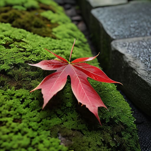
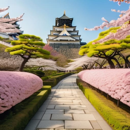
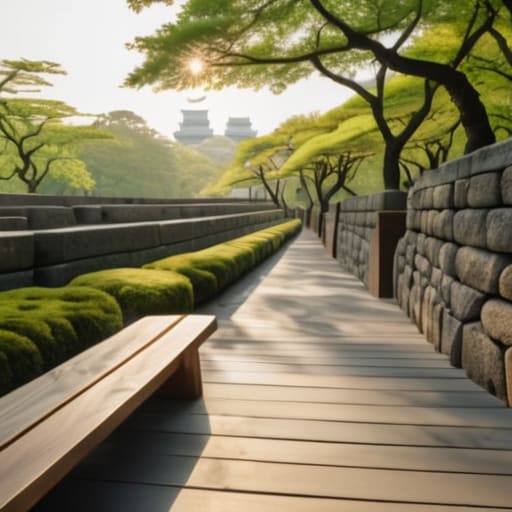
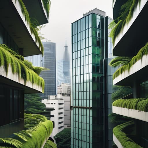
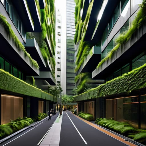
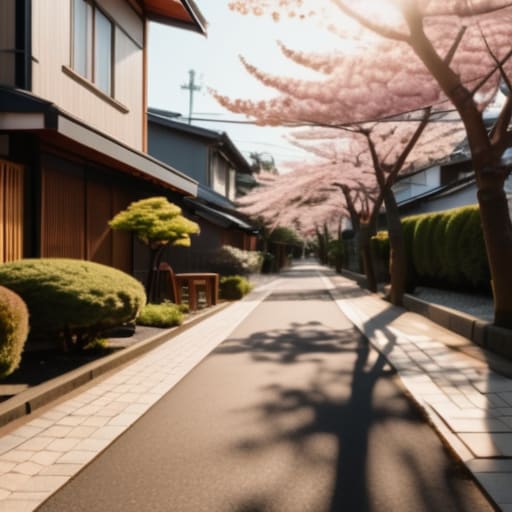
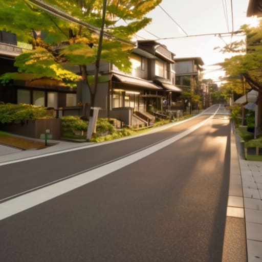
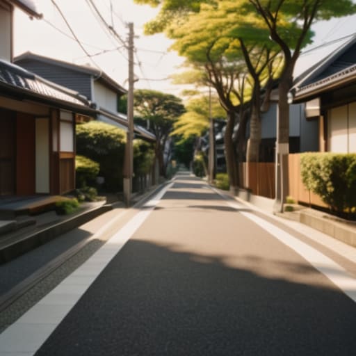
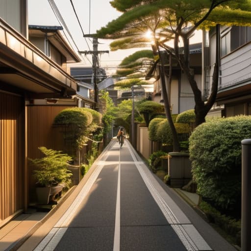
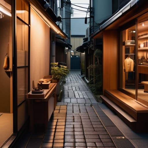
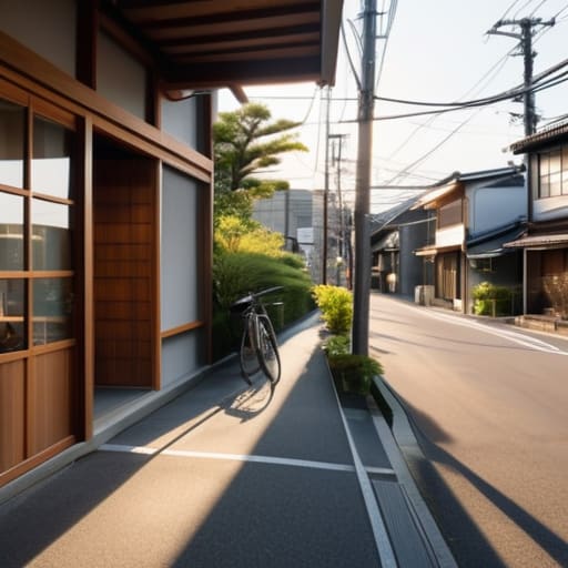
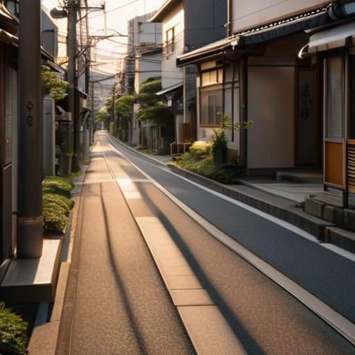
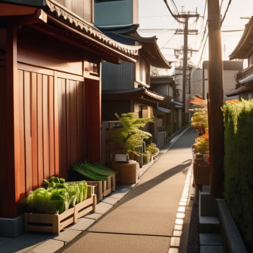
I often find myself ducking into narrow alleyways in Setagaya or the quiet backstreets of Namba, looking for where the concrete gives way to something more organic. It is in these small, neglected pockets that you truly observe the phenology of seasonal shifts. While the tourists are clustered around the grand cherry blossom parks, I am more interested in the way a single moss-covered stone in a temple courtyard deepens in hue as the humidity climbs, or how the sudden impact of temperature fluctuations in early November sends a premature cascade of maple leaves onto a damp sidewalk.
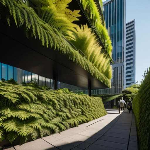
There is a specific, quiet dignity in how these micro-ecosystems respond to the passing months. I’ve spent many afternoons sketching how the light hits a particular patch of ferns, noting how the annual cycle of nature dictates their slow, rhythmic unfolding. In these hidden corners, the city doesn’t just change color; it changes its very breath. You see it in the way the shadows lengthen against a weathered wooden gate or how the scent of the air shifts from the crispness of winter to the heavy, damp promise of a Tokyo summer.
Tracking Seasonal Biodiversity Changes Through Transit Lines
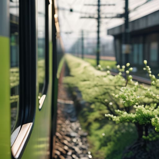
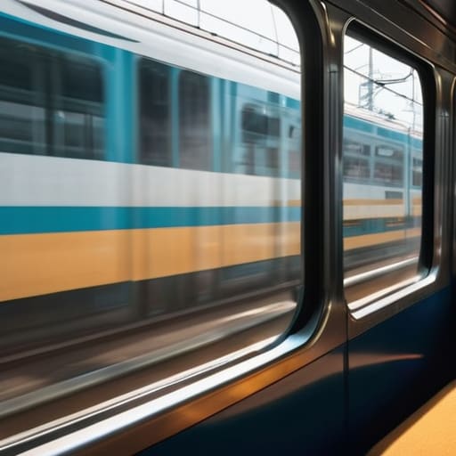
I’ve often found that the most reliable way to observe the phenology of seasonal shifts isn’t by looking at a calendar, but by watching the view from a moving train window. As the Chuo Line cuts through the outskirts of Tokyo, the transition is palpable. In early spring, the skeletal branches along the tracks begin to blur with a soft, pale green, a subtle signal that the dormant winter landscape is finally waking up. I find myself leaning toward the glass, noting how the specific timing of these buds seems to react to the micro-climates created by the concrete corridors of the rail lines.
By late summer, the rhythm changes entirely. The heavy, humid air seems to slow the movement of the commuters, and the greenery becomes a dense, suffocating wall of deep emerald. I’ve noticed that the seasonal biodiversity changes are most evident in the small, neglected patches of earth between the sleepers and the gravel. Even in these highly engineered environments, the impact of temperature fluctuations is visible in the way certain wildflowers retreat or flourish, providing a quiet, biological counterpoint to the relentless mechanical precision of the schedule.
Practical Observations for the Seasonal Voyager
- Carry a physical notebook, not just a phone. There is a specific way the light hits the ginkgo trees in late autumn that a digital photo can’t quite capture, and sketching the shift in shadows helps you actually process the change.
- Watch the commuters, not just the scenery. You can tell exactly when winter is settling into Tokyo by the way people adjust their posture and the sudden, rhythmic appearance of heavy scarves on the Yamanote Line.
- Follow the vending machines. They are the most reliable indicators of the micro-seasons; the shift from chilled barley tea to steaming canned coffee is the city’s most honest signal that the temperature has dropped.
- Use the transit maps as your guide to seasonal light. I find that certain stations, due to their depth or orientation, offer a specific quality of morning light during the equinoxes that makes the concrete feel almost alive.
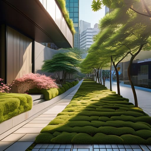
- Slow your pace at the edges of the city. The transition of seasons is often most visible in the small, neglected patches of greenery near the freight lines, where the wilder elements of nature react more sharply to the change than the manicured parks.
Lessons from the Urban Shift
True seasonal change isn’t found in the grand parks, but in the subtle way light hits a specific subway platform or how the air feels different in a narrow alleyway.
To understand a city’s rhythm, one must look past the tourist landmarks and observe how the transit systems and local flora adapt to the turning year.
Slowing down to notice these transitions allows us to see the functional beauty in the chaos, turning a mere commute into a moment of quiet observation.
The Geometry of Change
Most people see the seasons as a change in weather, but if you watch the way the light hits a concrete platform in November versus June, you realize it’s actually a shift in the city’s very architecture. The seasons don’t just change the temperature; they change the way the city holds its breath.
Rurik Salonen
The Quiet Constant
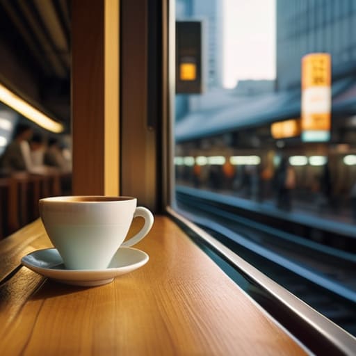
As I sit in a small cafe near Shinjuku Station, watching the commuters hurry through the changing light, I am reminded that these seasonal shifts are more than just aesthetic shifts in color. We have seen how the transition from the humid weight of summer to the crisp clarity of autumn alters everything from the density of the crowds on the platforms to the very way the light hits the station tiles. Whether it is the subtle migration of birds along the Yamanote Line or the way a sudden frost changes the mechanical rhythm of the city, these patterns reveal the underlying heartbeat of the metropolis. To ignore these changes is to miss the true mechanics of how a city lives and breathes.
In my years of managing logistics, I learned that efficiency is nothing without context. A city is not just a machine of steel and concrete; it is a living, breathing organism that responds to the tilt of the earth. My advice to those wandering these streets is simple: do not just move through the space, but observe the transitions. Stop looking at the landmarks and start looking at the way the shadows lengthen in December or how the scent of spring arrives on a subway breeze. When you learn to read these small, quiet signals, the city stops being a labyrinth and starts becoming a home.
Frequently Asked Questions
How do these seasonal shifts specifically impact the efficiency and flow of the major transit hubs?
When the heavy rains of June hit, or the biting winds of January settle over Shinjuku, the friction in the system becomes palpable. It isn’t just about delays; it’s a shift in human density. In winter, people huddle closer, their movements more jagged and hurried to escape the cold. In summer, the humidity slows the collective pace. I’ve noticed that even the most efficient hubs must recalibrate their rhythm to accommodate these subtle, seasonal shifts in human flow.
Are there particular times of year when the quiet, hidden corners become more difficult to find due to crowds?
The short answer is yes. During the peak of cherry blossom season in spring and the vibrant maple shifts in autumn, the city’s breathing becomes labored. The quiet corners I seek—those small, moss-covered shrines or tucked-away alleyways—often lose their solitude to the swell of visitors. If you want to find the stillness, aim for the “in-between” months. Late February or early June offer a certain structural clarity that the crowds simply strip away.
Which specific analog film stocks do you find best capture the changing light of the seasons in the city?
For the biting clarity of winter or those crisp, high-contrast spring mornings, I find myself reaching for Kodak Ektar 100. Its fine grain handles the harsh urban shadows beautifully. However, when the humid, heavy light of a Tokyo summer sets in, I prefer Fujifilm Pro 400H. It has a way of softening the glare off the concrete and capturing those subtle, verdant greens that define the city’s changing pulse.